In 2019, we were commissioned by the Municipality of Valsamoggia to develop a dedicated brand and territorial marketing project.The creation of the Valsamoggia brand is the result of a participatory design activity with local communities, for which we collaborated with CO Group.
CO Group promoted and led four workshops for the shared development of the brand, which were attended by key representatives of economic and social associations, the productive network and local institutions.
With this approach, we wanted to gather as many opinions and points of view about the area as possible, and then channel all these visions into the design of a brand capable of speaking and representing the people and places of Valsamoggia. The NEXT STOP VALSAMOGGIA focus group followed the workshops, and helped us lay the groundwork for the subsequent creation of the logo through Lego Serious Play.
Art and culture
Red
R 175 G 27 B 56
Comunity
Yellow
R 244 G 194 B 80
Landscape
Green
R 137 G 183 B 40
Productivity
Light blue
R 125 G 165 B 216
Enogastronomy
Beige
R 210 G 151 B 100
Brand Identity
Logo design and advertising graphics
From the results of the workshops, we animated the creative process by transforming the theoretical results into graphics.
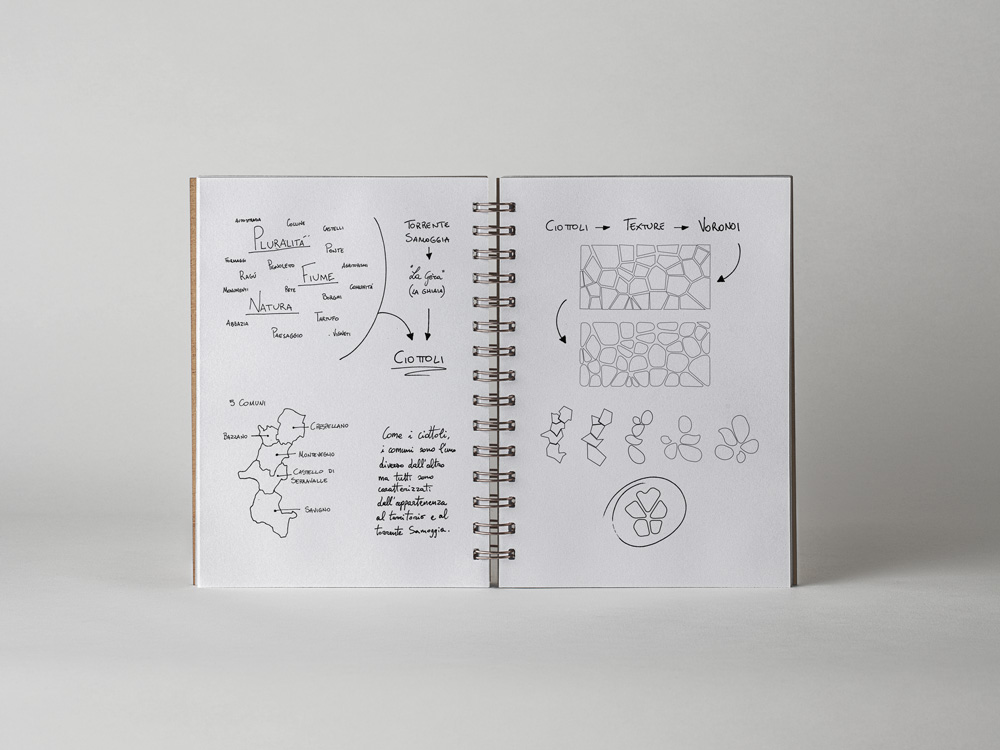
In particular, the concept of plurality and the Samoggia stream, which emerged from the previous brainstorms, inspired a graphic imagery composed of elements that recalled the river: we explored a pattern inspired by a mosaic of pebbles and gravel, a path made of dots, lines and polygons.
The image of the gravel mosaic, linking to the concept of plurality, made us consider the representation of a set of parts, a concept described by a particular mathematical object called Voronoi diagram, leading us to identify a partition of the mosaic and iconizing in it the arrangement of the municipalities belonging to Valsamoggia, in a brand in five colors, one for each area of tourist interest, able to be immediately referable to the territory and its identity.
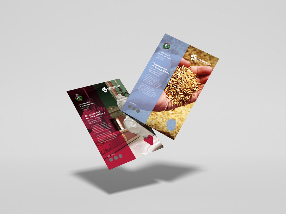
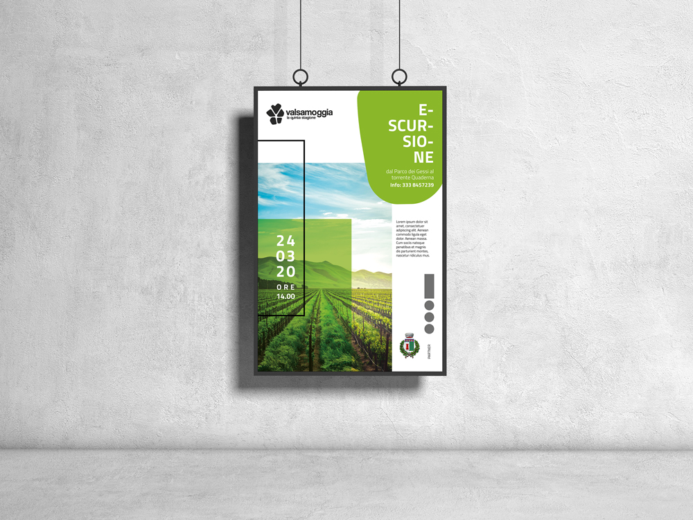
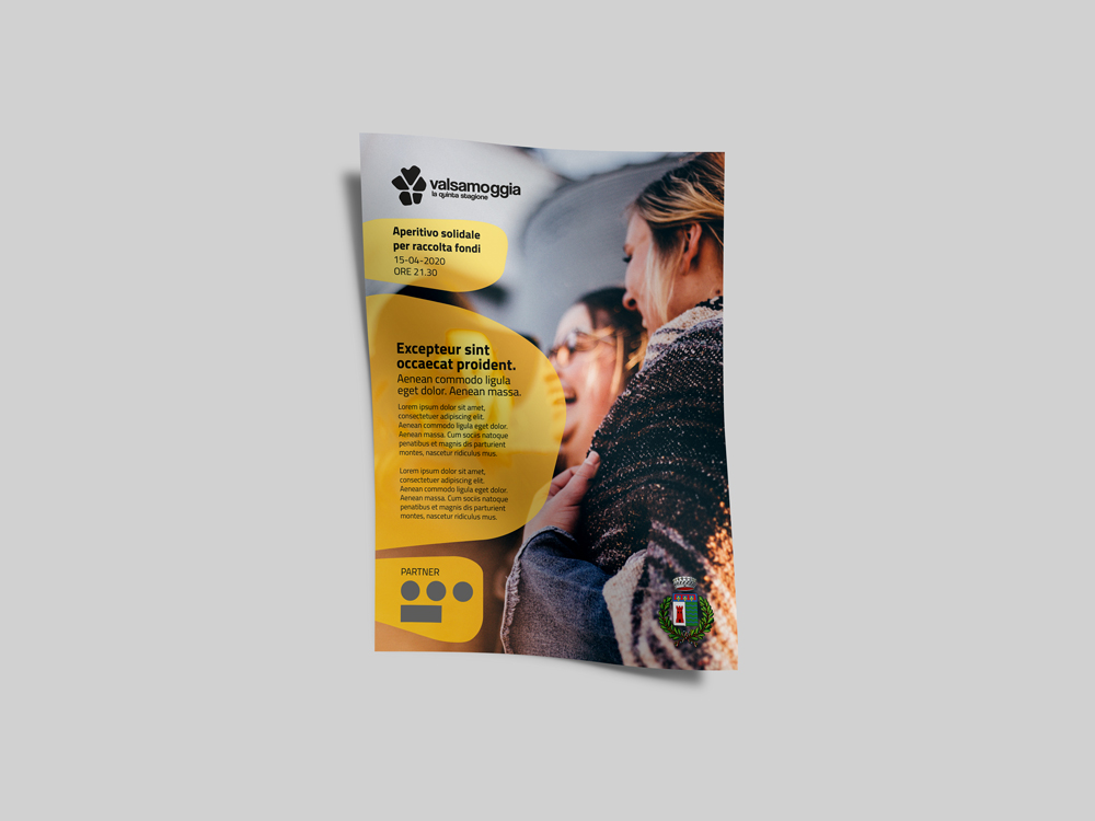
Finally, we were commissioned to develop the graphic concept previously created for a project intended for the communication of activities and events. We developed the new cover of the bimonthly editorial promoting the activities of the municipality and its graphic cage. We came up with various templates for posters and posters to be put up in the area.